
Bringing Back the Joy of Going Out: Designing Doors @ 8
For many users, purchasing tickets feels anything but joyful. Faced with inflated prices, and unclear fees, even the anticipation of a great night out can quickly become overwhelming.
Our team set out to reimagine the ticketing experience with a people-first approach. The result was Doors @ 8, a mobile-first ticketing platform designed to prioritize transparency, ease of use, and genuine community connection—helping users rediscover the excitement of planning live events with friends, without the friction.

Glitches in the Groove
The current ticketing landscape—dominated by major platforms like Ticketmaster—creates a range of challenges for event-goers:
-
Drastically fluctuating prices
-
Tickets disappearing during checkout
-
Hidden service fees added at the final step
-
Fragmented discovery and purchasing across multiple apps
Through user interviews and journey mapping, it became clear: users were losing trust in the process. What should have been a simple, joyful interaction had become a source of stress and disappointment.

Interview Takeaways: From Frustration to Focus
Through user interviews with frequent event-goers, we uncovered key pain points that shaped our direction:
-
Ticketing was stressful and unpredictable — disappearing seats, sudden price jumps, and unclear fees.
-
Event planning was scattered — users bounced between multiple apps just to coordinate one night out.
-
Social features were lacking — people wanted a seamless way to invite friends, split costs, and share tickets.
-
Trust in platforms was low — users felt burned by hidden fees and poor transparency.
These consistent themes led us to create our primary persona, Cameron—a music-loving, socially active user looking for a simpler, more trustworthy way to discover and plan live events with friends.


Meet Cameron: Our User Persona

To keep our solution grounded in real needs, we developed a primary user persona:
Cameron is a young professional in NYC who regularly attends concerts and nightlife events. She’s highly connected through social media and often takes the lead in planning outings with friends. But she’s frustrated with the fractured experience of event discovery and ticket sharing. She bounces between multiple apps, struggles to keep track of event details, and avoids Ticketmaster entirely due to past negative experiences.
Cameron’s pain points helped shape our priorities:
-
She wants to discover events easily, all in one place
-
She needs seamless ways to share tickets and plan with friends
-
She values transparency and is turned off by hidden costs or surprises
-
She prefers smaller, more intimate venues where community matters
Defining What Matters: MoSCoW Prioritization
We used the MoSCoW method to organize features based on user needs:
Must-Haves
-
Transparent, upfront pricing
-
Simple, streamlined checkout flow
-
Real-time ticket locking during purchase
-
Mobile-first, responsive design
Should-Haves
-
Trusted, bot-resistant resale system
-
In-app chat for sharing, planning, and splitting payments
Could-Haves
-
Personalized event feed
-
Community-driven reviews and artist highlights
Mapping the Experience

To support a seamless user journey, we developed a streamlined sitemap grounded in user research. Our goal was to simplify discovery, ticket purchasing, and sharing—without overwhelming the user.
From Wireframes to High-Fidelity Prototypes
Using insights from users like Cameron, we began with low-fidelity wireframes to rapidly test and iterate. Once core flows were validated, we translated those ideas into high-fidelity designs in Figma.
Key Screens:
-
Home Page: Curated event feed designed for visual scanning and discovery, inspired by the simplicity of music playlists
-
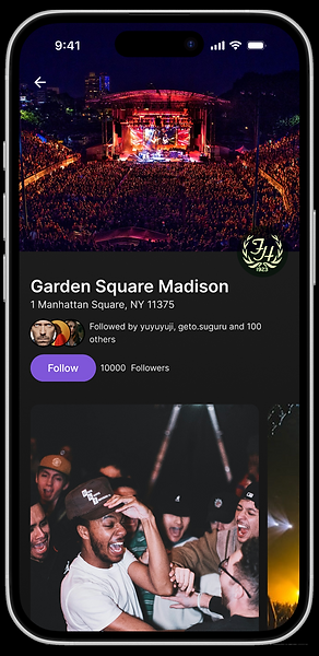
Event Detail Page: Clean, informative layout featuring pricing, artist previews, accessibility info, and venue vibes
-
Chat & Ticket Sharing: Integrated messaging and ticket management for simplified group planning and payment coordination


Final Features Delivered
-
Transparent, no-surprise pricing
-
Mobile-optimized design
-
Secure QR code entry
-
Real-time ticket reservation
-
Resale protection and ticket integrity
-
In-app chat, sharing, and planning tools
Cameron's Journey Map

Reflections & Outcomes
Doors @ 8 offers more than just another way to buy tickets—it reimagines what the experience could feel like. By putting users first, we created a platform rooted in clarity, connection, and fairness.
What I Took Away from This Project:
-
The value of empathy in identifying hidden friction points
-
How systems thinking supports both user needs and backend logic (like ticket locking)
-
The power of collaboration and focused prioritization in keeping the vision clear
-
That real innovation often begins with asking the right questions
Doors @ 8 reclaims the experience of going out—from that first moment of discovery to the final scan at the venue door—with joy, ease, and a sense of shared excitement.